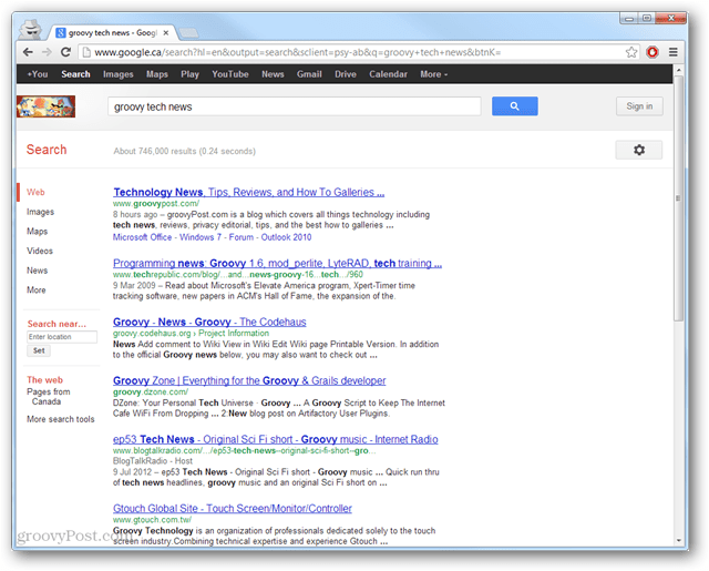
Google announced that this new design will first roll out to users of the .com (U.S.) Google search domain, and others should be getting it as soon as possible. Previous Google Layout:
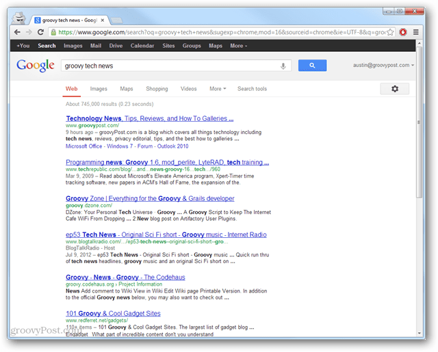
Current New Google Layout:
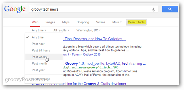
The search tools in the new layout might be a little trickier to find, but according to Google they work much better on mobile. I gave the new site a spin using a Kindle Fire HD, and a Samsung Galaxy SII. As advertised, the site does work quite well on mobile.
Although the new design got rid of the sidebar options, currently there is nothing to fill its space. The new tabs are also in a location that previously wasn’t utilized.
More screen space is now utilized, and vertical viewing isn’t sacrificed at all to make it happen. I like the new layout after using it for a while, but it certainly took some getting used to. The question is, what do you think Google will do with all of its extra sidebar space? More ads? Comment Name * Email *
Δ Save my name and email and send me emails as new comments are made to this post.


